


The Art of Sound
A Journey Through LP Cover Design

There was a time when music wasn’t just something you heard—it was something you held. The LP cover, a twelve-by-twelve canvas, became a visual gateway to sound, a first impression that hinted at the mood, style, and ambition of the grooves inside. Before digital thumbnails and streaming playlists reduced music to an ephemeral flicker on a screen, album covers were cultural artifacts, lovingly designed, obsessively collected, and endlessly analyzed. They told stories, not just of the musicians, but of the eras that produced them.
In the early days of recorded music, album packaging was little more than a utilitarian sleeve—a brown paper bag for sound. That changed in 1939, when Alex Steinweiss, a 23-year-old designer at Columbia Records, decided that music deserved better. His first illustrated cover, a stylized representation of Beethoven’s works, transformed sales and revolutionized the industry. Soon, album covers became as integral to the experience as the music itself.
By the 1950s, cover art had become a language of its own, particularly in jazz and blues, where designers had the freedom to experiment. Record labels like Blue Note, Verve, Prestige, and Chess treated album covers as high art, commissioning bold photography, innovative typography, and striking illustrations. Jazz, with its improvisational spirit, demanded an aesthetic as dynamic as the music itself, and designers like Reid Miles and David Stone Martin delivered in spades.
Golden Age: The LP as High Art
The 1960s and 1970s ushered in a golden age of album design. Rock and jazz albums became visual statements as much as sonic ones. Reid Miles, Blue Note’s in-house genius, gave jazz a sleek, modernist look—clean typography, moody photography, and striking colours. Covers like Horace Silver’s Song for My Father or Eric Dolphy’s Out to Lunch! became as iconic as the music.
In the rock world, album art took on a surreal, avant-garde edge. Hipgnosis, the British design collective led by Storm Thorgerson and Aubrey Powell, redefined the visual language of rock. Their work on Pink Floyd’s The Dark Side of the Moon and Led Zeppelin’s Houses of the Holy turned album covers into dreamlike landscapes, inviting the listener into a world beyond the music.
Then there was Andy Warhol, who brought pop art into the mix. His banana design for The Velvet Underground & Nico and the infamous working zipper on The Rolling Stones’ Sticky Fingers blurred the line between fine art and commercial design. Meanwhile, Roger Dean crafted fantasy landscapes for Yes and Asia, creating a visual mythology to match the expansive soundscapes within.
Most Memorable Covers: The Icons of LP Design
Some covers transcend their era and become cultural touchstones:
• The Beatles – Sgt. Pepper’s Lonely Hearts Club Band (1967): A maximalist collage of pop culture and psychedelia.
• Pink Floyd – The Dark Side of the Moon (1973): A prism, simple yet profound, burned into the consciousness of generations.
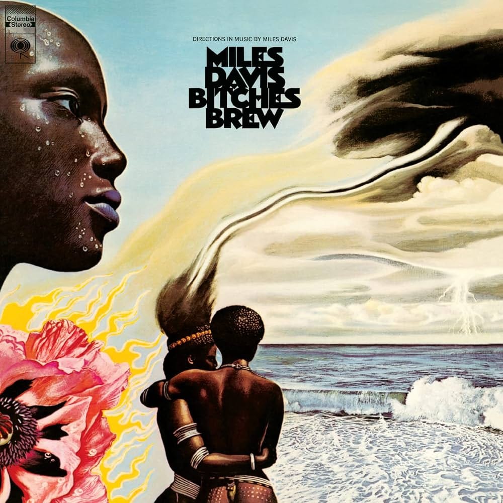
• Miles Davis – Bitches Brew (1970): Mati Klarwein’s Afro-futuristic, psychedelic masterpiece mirrors the revolutionary music inside.
• The Clash – London Calling (1979): A photograph of Paul Simonon smashing his bass, echoing Elvis Presley’s debut cover, but replacing youthful rebellion with pure punk fury.
• King Crimson – In the Court of the Crimson King (1969): A terrifying, wide-eyed scream painted by Barry Godber, embodying the unhinged brilliance of progressive rock.
Jazz & Blues: The Cool, The Gritty, The Timeless
While rock indulged in surrealism and excess, jazz and blues covers often embraced a raw, intimate aesthetic.
• John Coltrane – Blue Train (1958): A Francis Wolff photograph, with Coltrane lost in thought, framed by Reid Miles’ signature typography.
• Thelonious Monk – Brilliant Corners (1957): A split-portrait cover reflecting Monk’s unconventional genius.
• Robert Johnson – King of the Delta Blues Singers (1961): A grainy, shadowy image that reinforced Johnson’s enigmatic legend.
• Howlin’ Wolf – Moanin’ in the Moonlight (1959): A stark, evocative depiction of Wolf’s haunting blues.
• B.B. King – Live at the Regal (1965): A deep-blue tone encapsulating King’s masterful stage presence.
The Digital Shift & The Vinyl Resurgence
The arrival of CDs in the 1980s shrank album covers a fraction of their former size, and by the 2000s, streaming all but erased them as a tangible experience. Music became disembodied, stripped of its visual counterpart. But something was lost in that transition—album art wasn’t just decoration, it was part of the storytelling, an extension of the music itself.
Now, with the vinyl revival, album art is reclaiming its place. New artists and designers are once again treating LP covers as canvases, understanding that an album isn’t just something you hear—it’s something you experience. The best covers pull you in before the needle even drops, setting the stage for what’s to come. In an era where music has become weightless, the LP remains a tangible piece of history, and its cover—a window into the soul of the sound.
Great album covers aren’t just images; they’re invitations. They make you want to hold the record, study its details, and lose yourself in the world it creates. They remind us that music is more than sound-waves—it’s a total experience. And as long as artists continue to push boundaries, as long as vinyl spins on turntables and collectors cherish their records, the art of the LP cover will live on—bold, beautiful, and just as essential as the music itself.
The piece of cover art was fascinating, but I wish you had mentioned the work of my late friend and collaborator Micheal Wrycraft. As a graphic designer he specialized in album covers (plus posters, record labels, interior sleeve notes, post cards etc. — what he called "designs for music." In fact, he designed some 600 album covers (and associated artwork, including most (if not all) of Bruce Cockburn's albums, as well as those of Blackie & The Rodeo Kings.. His work was of the highest quality... And on a personal level he was a dear friend, with a heart — and a spirit of optimism — as big as his body!